While everyone was busy playing with their shiny new smartphones, a revolution in web design happened. Few people noticed it, which is fine because they were not supposed to – in fact, the entire point of the change was to make web content more easily readable and navigate on any sized device, including phones.
This revolution is still continuing quietly in the background. It has already changed the way pages are built and displayed, and the principles behind it will determine the way information is shown and processed for decades to come. Because this is not just a small change in style and layout; but a real transformation of how onscreen data is processed and presented.
CSS and HTML
As shown in the last article, HTML is the foundation of the web. But HTML is simply about delivering information, not doing anything with it. Webpages must be much more than a data dump to make them look good and function well.
While HTML has certain styling elements built in – it is possible to specify fonts, colors and basic layout – it was invented as a way of sharing scientific information online. Clarity and legibility were desired; anything more was an afterthought.
Since styles in HTML could at first only be specified for individual items, this made for long and confusing documents with much repetitious code which made appearances hard to modify. That may be acceptable for scientific papers, but as the web opened up and people wanted to use it to spread news, share art and photography, and especially to sell goods, HTML’s limitations soon became glaringly obvious. To get around these restrictions, a number of hacks were invented, clever ways to do things that HTML was never intended to do.
For example, HTML has very simple native layout capabilities. Basically, one can put things lined up on either side of the page or in the middle. Designers quickly resorted to tables to make any sort of more sophisticated arrangement. Tables in HTML are meant to arrange arrays of data in rows and columns, but the individual size of cells can be changed and cells can be put into cells. This allowed a great variety of layouts with elements in a somewhat-fixed relationship to each other.
The reason it was “somewhat-fixed” is because of the big problem of web design. All webpages are fundamentally dependent on the devices they appear on. Fonts may be specified; but not every computer has the same ones. Layouts may be designed that work perfectly for a certain sized screen, but on other sized screens they might not fit.
Not only that but the user has the final say. They can change fonts, colors, and sizes their browser displays at whim. Plus, just like with HTML, one company or another may deliberately use its own proprietary workarounds to accomplish the same result to get a leg up on the competition. A really good web designer has to anticipate and accommodate all these variables in order to make content useful for everyone and looks consistent on whatever device or browser is used, and that can be a really crazy-making task.
So the second pillar of web design, CSS (Cascading Style Sheets), the essential means of making pages that are easy and desirable to read, is almost as important as HTML. The need for it was spotted immediately, and the first proposals came out in 1994, the same year the web went public. A colleague of Tim Berners-Lee, computer scientist Håkon Wium Lie, along with Gijsbert Bos, made the leading proposals for methods to split presentation off from content.
It took two years to get their first version agreed upon, and the second one a year after that. The real revolution began with CSS 3, which followed after a long gap, and was divided into various sets of rules for different features, called modules. Soon after, some specifications confusingly became much more advanced than others, so “snapshots” – summaries of current best practices – were issued at various points for developers. Now there are now CSS frameworks, systems that lend uniform consistency to layouts. More on them later.
How CSS works
Like the name HTML, CSS is actually a pretty good description of what it does. A “Cascading Style Sheet” is a collection of stylistic rules governing the presentation of content in an HTML-structured document. The “cascading” part comes from how the system prioritizes those rules: the top, or first rule generally applies broadly, modified by lower rules, with the last having the most influence.
For instance, this makes it possible to easily define all headings as blue, and make an exception lower down for one that needs to be red. So the lowest rule actually has top priority.
This is important as CSS can be written as a separate document linked to a number of webpages, making it possible to alter the looks of an entire site much more quickly. Modifications for entire pages or classes of items (such as all the subheads) could then be placed in the document’s header along with other information not meant to be seen. And finally, further tweaks can be set inline to modify individual elements (like just one paragraph) and even single words.
Moreover, by default, properties are inheritable. Specifications for one thing applies to other things inside or descending from it unless overridden by a later occurrence of another rule. This, too, benefits overall consistency and eases modification.
CSS 3 overcame most of the difficulties surrounding layout. Instead of left, right, and center, above or below, items may now be placed in relation to others with precision down to single pixels. Plus, there are rules that govern how they behave in different sized windows, when scrolling, and so forth.
There are also various ways of condensing expressions or using alternatives. For a sometimes helpful but often confusing feature of CSS is that the same things can often be expressed in more than one way. For example, colors can be specified by no less than 7 different methods, including by various mathematical values, by predefined name, or by simply referring to the last use.
Placement can be even more perplexing. Lengths can be relative to the viewing devices (often expressed as percentages of the screen size) or absolute (in units like inches or pixels). In addition, they can be applied to the font and the space surrounding the words on all four sides, with properties including width, margin, border, and padding, all of which can be very similar but definitely not the same.
Problems remain since just like with HTML, various browsers use their own interpretations of the rules. This has led to a number of CSS hacks to get around these quirks, by writing rules that will only function in one browser and be ignored by all others. This means that other rules to do the same thing for other browsers have to be written, which can be very frustrating, especially as many designers do not understand all of CSS’ many subtleties. CSS started with a simple need and easily understandable code, but applying it to all the problems of webpage design has made it as complex as it is flexible and very powerful.
CSS still has a ways to go. New applications have come with aural style sheets – CSS for listening to written content using speech synthesizers – and for animatable elements (like causing links to change color when pointed at). This last one shows that CSS is intruding on scripts, like Javascript that add motion and liveliness to the page.
Yet CSS has become so essential to webpage readability that when it doesn’t load or the code is improperly written, the page is not only boring, it’s often useless gibberish. Often it takes just one missing character to wreck things. That, and the different hacks necessary to make the same page read well on different devices and browsers, mean that websites still have to rigorously tested across the entire range of screens and browsers: desktop, laptop, tablet, phone; Apple, Microsoft; Safari, Edge, and Chrome, etc.
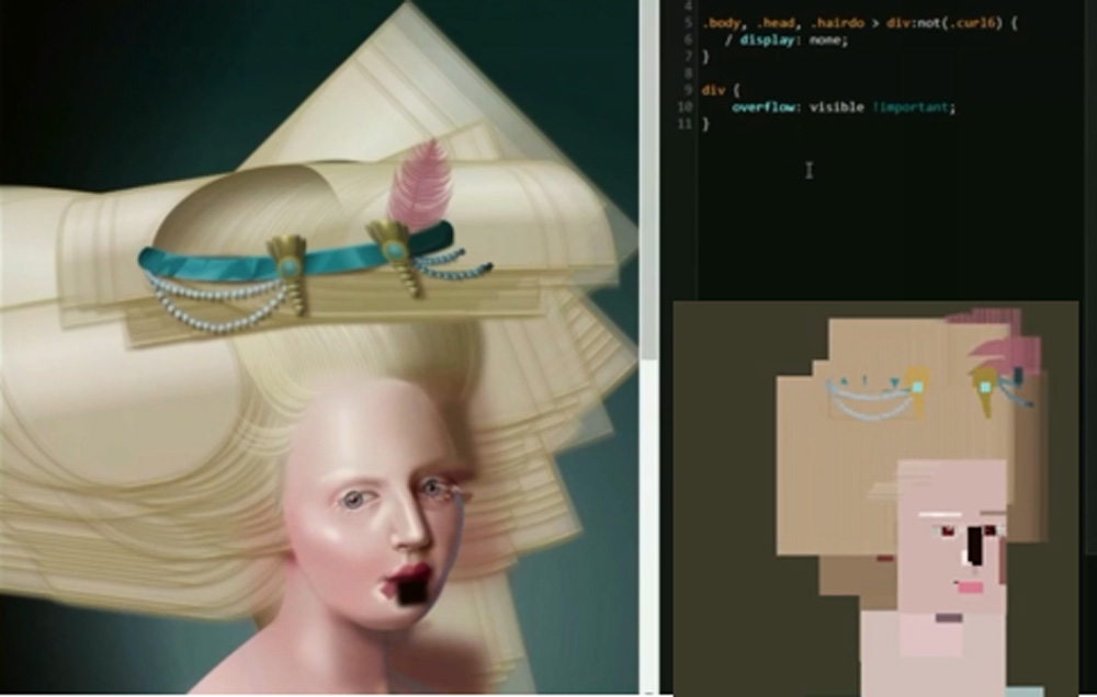
But CSS is so advanced and precise now that amazingly, fine art and even simple animations can be created using nothing but pure CSS code! The image for this article shows a finished piece by artist/coder Diane Smith, with the finished version on the left and how it would be rendered in an old version of Firefox underneath a bit of code.
Size matters
Some limitations, including longstanding difficulties in controlling vertical placement have been improved by new webpage concepts and models. These recently-developed CSS frameworks improve the situation by standardization, which is the basis of the unnoticed revolution.
Once again, it was Apple that changed the world, this time with the iPhone. Before the advent of the smartphone, online artwork (particularly icons and buttons) used a lot of shadows, beveled edges, shading and highlights to give depth and a three-dimensional feel. The fancy design word is “skeuomorphism” which means familiarity by emulating materials.
The attempt to be “realistic” came about not just because designers went whacky with Photoshop (though there was plenty of that) but because people were still getting used to interactive screens. Just as computer widgets were given names and icons of similar physical things (like directories being called “folders”), so too applying a 3-dimensional real feel to things helped ease the transition to the virtual world.
By the time the iPad and the iPhone came along, people had largely gotten used to computer icons, and touchscreens enabled direct physical interaction with things that could formerly only be manipulated with a mouse. More importantly, viewing screens were getting tinier. All those carefully-rendered 3D icons became blurry and unreadable at smaller scales.
Not only that, but little screens simply couldn’t hold much information, nor did people using a phone on the go even want the same things as they did when sitting down in front of a desktop computer. Designers were thus confronted with the necessity of building websites that behaved differently on a big screen or a handheld one. And CSS came to the rescue.
Looks changed first. Around 2011, Apple’s graphics suddenly went flat. Simple and clean became the new trend. Distracting shadows, complex backgrounds, and 3D effects like rounding and highlights gradually disappeared. Google closely followed with “material design” which was almost as flat but gave a small nod to paper-like textures and shadows, and Microsoft joined in with their own “fluent design”. Redesigned icons and logos were reduced to flat abstracts, even fonts lost their flourishes, and white space and simple shapes ruled.
But that was just the start of the revolution. Ironically, as soon as CSS achieved the range and versatility to render almost any design in code, it started to be standardized. This was necessary since all that code could be incredibly complex and repetitive. So various tricks were needed to simplify it.
CSS frameworks were developed out of concepts like that of W3C core styles, which provided safe working CSS 1 and 2 style sheets for non-designers. Frameworks restrict and simplify layouts to make appearances consistent throughout pages and sites. Most are based on a grid system of layout. Flexbox is a one such layout scheme that applies grids to HTML content containers and hierarchies. Other systems, like Bootstrap, are meant for designing responsive websites, those which work for any sized screen; big desktops or tiny phones. To further simplify things, there are CSS interpreters, for instance, like Sass, a language to extend CSS and make it much easier to work with.
The reason for all this are those responsive websites for phones. Since it is possible with HTML to detect the size of the screen to which the webpage is being sent, scripts could use this information to select the right CSS to scale down layouts and strip out unneeded information for the small screens or pile on features for the larger.
Despite all the useful and clever features in HTML and CSS, one more leg is needed to make webpages truly interactive and able to do more than just present static information but process it on the fly. For that, scripts – embedded programs that use their own languages – are necessary, and will be covered in the next article.